CASE STUDY
Sage Recommendation Tool was an interactive pricing experience for Sage for Accountants, designed to make plan selection clearer and less overwhelming.
I led the design of the calculator and, when implementation became a blocker, took ownership of bringing it to life on Dot.vu. The work bridged interaction design, pricing logic and technical constraints to turn a complex comparison flow into something more usable.
THE PROBLEM
Users needed a clearer way to compare plans, understand costs and choose the right option for their needs, without oversimplifying the pricing model.
MY ROLE
Contract interaction designer leading the calculator experience, then stepping into implementation ownership to bridge design, logic and platform limitations with the Dot.vu team.
THE FOCUS
Create a scalable recommendation pattern that simplified complex pricing decisions, worked responsively and could become a stronger foundation for future calculator experiences.
OUTCOME
VIEW LIVE TOOL
1st
successful Sage calculator delivered on Dot.vu after earlier attempts had stalled
Live
embedded recommendation tool supporting clearer plan selection on the Sage pricing journey
Scalable
approach that pushed for more reusable logic-driven experiences across future calculator work
Our biggest challenge as a team was ensuring all stakeholders were aligned on objectives and timelines, and making realistic compromises knowing this would be our first approach to this tool and there would be future iterations.
CHALLENGE
CONTEXT
Users struggled to understand and compare pricing plans, leading to decision fatigue and lower conversions.
PROBLEM
The existing process of manual calculation was time-consuming, error-prone, and not visually intuitive.
GOAL
Create an interactive, responsive, and accessible tool that provides clear recommendations and cost breakdowns.
SOLUTION
A dynamic pricing simulator embedded on the pricing page, leveraging Dot.vu for interactive logic and calculations.
I explored previous calculator solutions designed for other products within the company and in close collaboration with another UX/UI Designer from the team we had multiple meetings with stakeholders to define the scope of this project and come to realistic goals for our first version of the calculator.
KEY INSIGHTS
- Simplify complex pricing structures into digestible components.
- Ensure mobile responsiveness and accessibility.
- Provide a clear breakdown of savings and costs for better user comprehension.
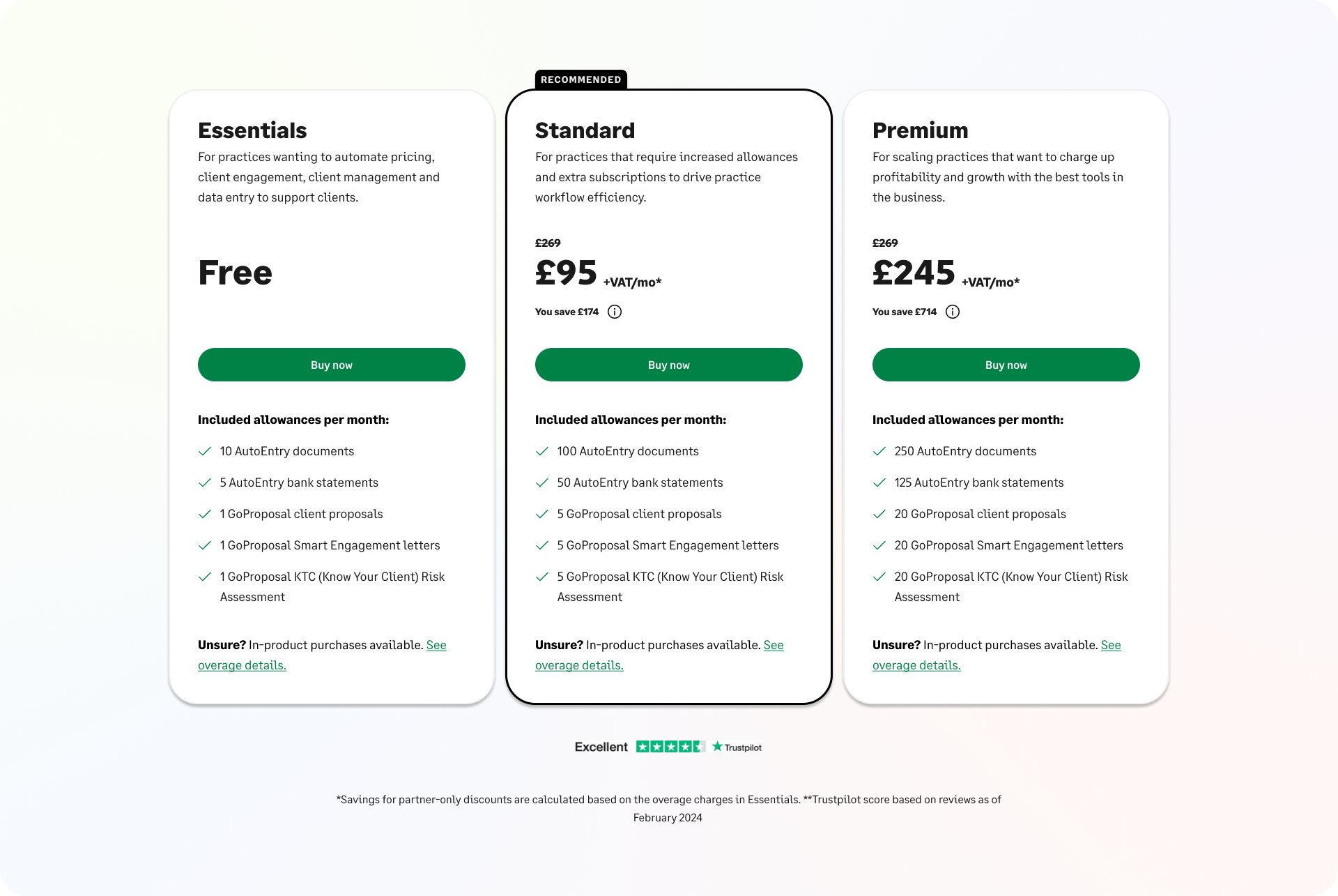
SFA PLANS TO RECOMMEND
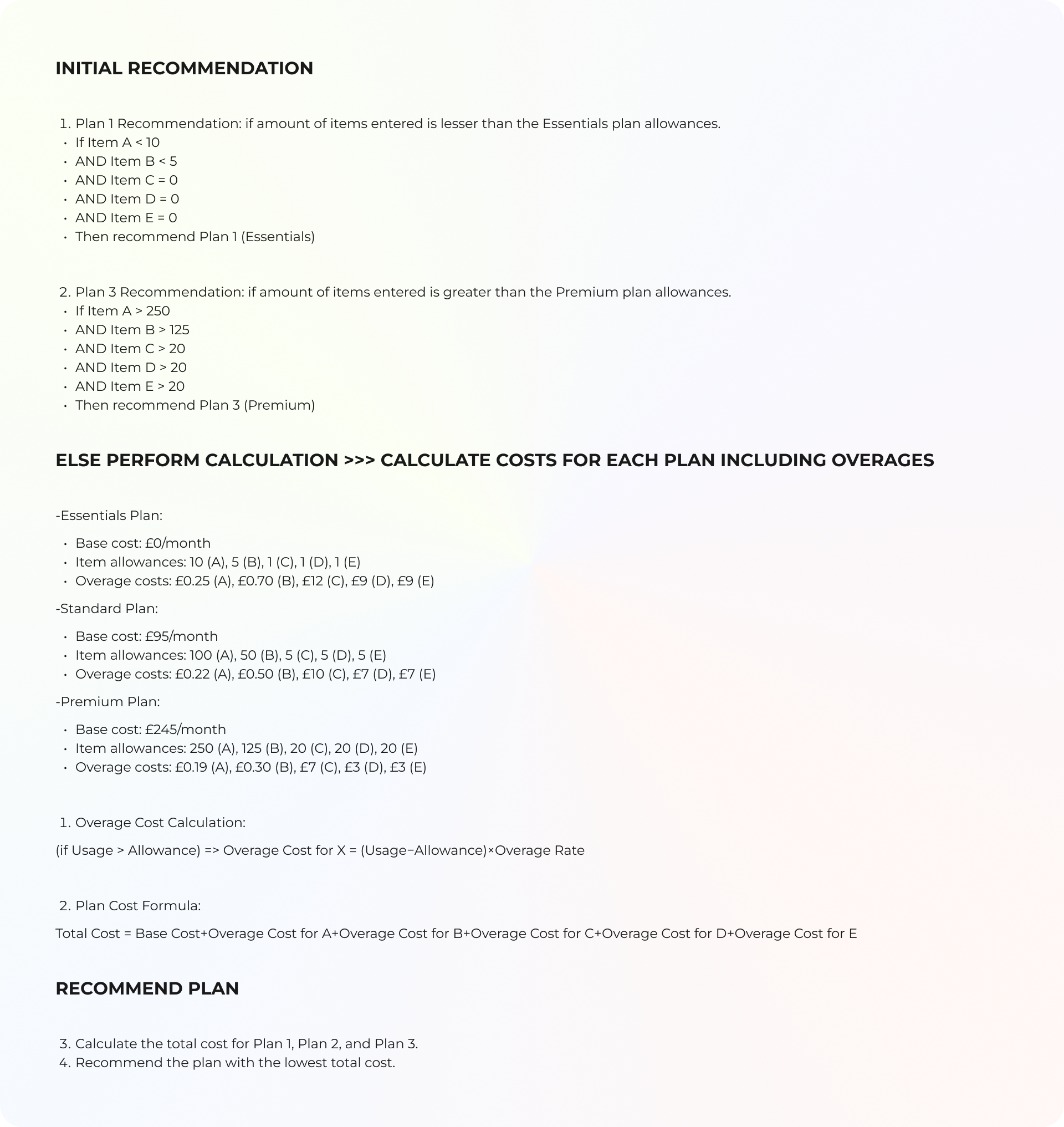
LOGIC
I created this file along with a complementary JavaScript file to help visualize the logic clearly for all stakeholders throughout the process. This approach ensures a shared understanding and facilitates alignment across teams.
Troughout this process we:
- Explored different layouts for displaying pricing details.
- Brainstormed how to integrate the tool seamlessly into the pricing page without disrupting user flow.
- Worked with the content team to rephrase input questions for clarity and action-orientation.
- Designed multiple interactive flows to test usability (e.g., modal vs. embedded).
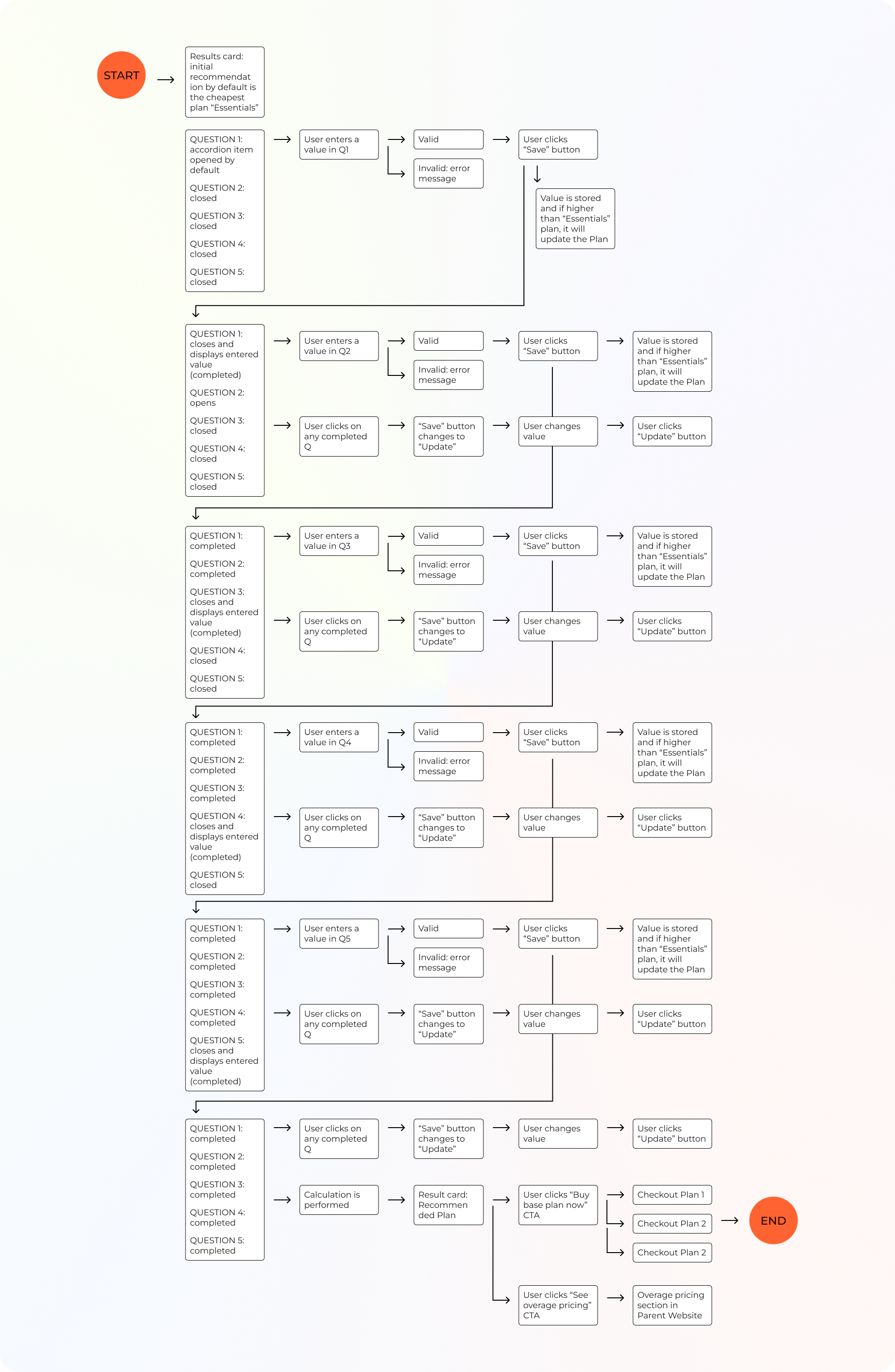
USERFLOW
We created high-fidelity prototypes in Figma, incorporating feedback from seven rounds of meetings with stakeholders and internal teams:
- Accessibility: replacing tooltips with in-line explanations.
- Usability: adding visible feedback for user selections.
- Responsiveness: adapting the design for both desktop and mobile.
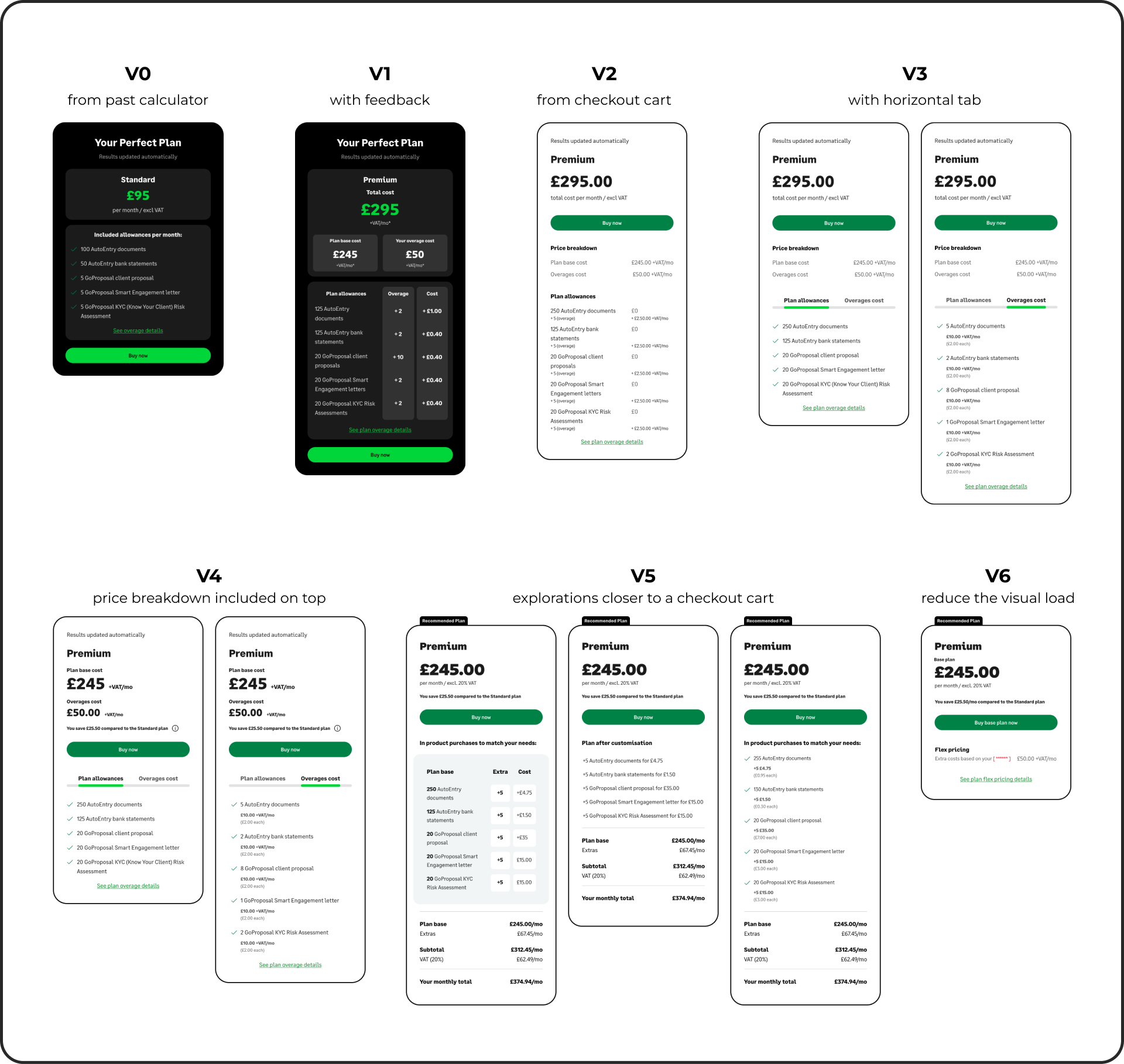
WIREFRAMES
VERSION 1
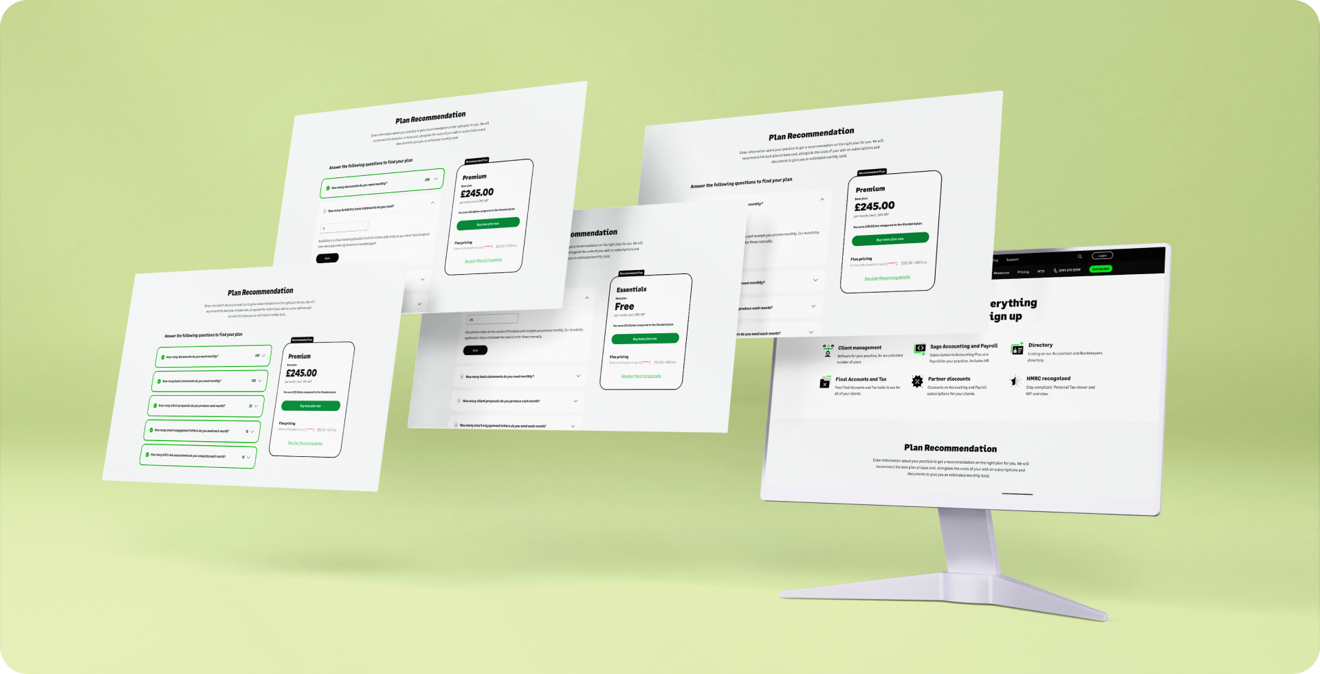
I developed an initial solution concept leveraging an existing calculator previously used within the company, ensuring alignment with the latest updates to our Design System. It features an interactive accordion with five questions. Once all five questions are answered, the result card is automatically updated to reflect the input. Additionally, the result card recalculates in real-time if any values are modified.
FEEDBACK
- Accommodate both the plan recommendation and how much the overages that the customer has chosen will cost.
- Questions should be phrased in a way that they focus on the action and not the name of the item (e.g. “How many times per month do you have to send a proposal to a client?”).
- The dark results card wasn't approved by the Design System expert.
- Replacing tool tip with paragraph: more accessible, not avoidable although it looks busier.
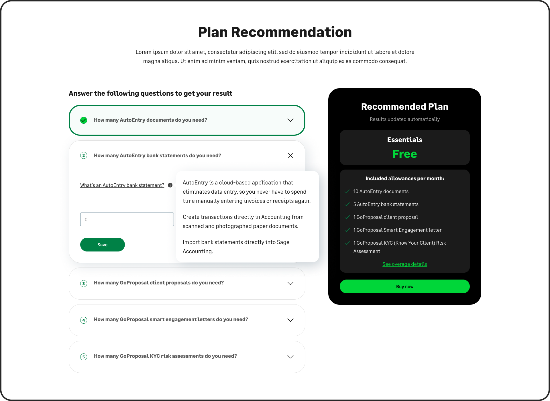
VERSION 2
In this iteration, we started exploring different result cards, more aligned with the current design of the chechout cart. To improve accessibility, the tooltips were replaced by inline paragraphs.
FEEDBACK
- Explanation looks like part of the Q and users might not read it.
- Need to make clear that you pay just for the plan when you sign up, and overages are in product purchases.
- No need to say "Results updated automatcially". Show the number and price changing as the user makes selection.
- Replace X icon with chevron pointing up.
- If the free version comes with 10 AutoEntry document, have 10 as the default value in the field.
RESULT CARD
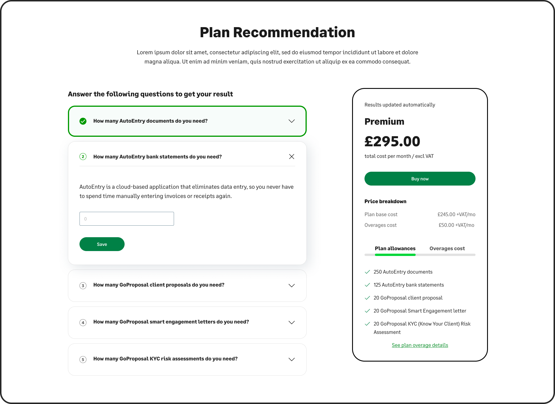
FINAL VERSION
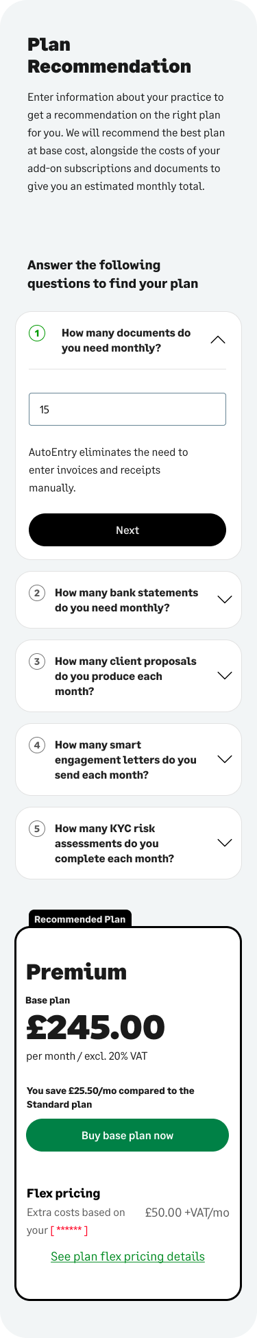
Usability testing was at this stage conducted with internal teams and stakeholders. We iterated the design several times based on all the feedback that we gathered:
DESIGN FEEDBACK
Plan Comparisons:
- If costs are the same for two plans, recommend the plan with more allowances.
- Show total cost (base cost + overage costs) and clearly display included allowances and overage breakdown.
- Modify layout of price breakdown for better clarity.
Copy and Content:
- Use action-oriented phrasing for input questions (e.g., “How many times per month do you send a proposal?”).
- Add an explanation for flex pricing (previously called overages) below the heading.
- Include a default value for allowances in the free version (e.g., 10 AutoEntry documents).
- Clearly explain that overages are additional in-product purchases, not included in the initial plan cost.
- Add “You are saving this much compared to X plan” messaging for value display.
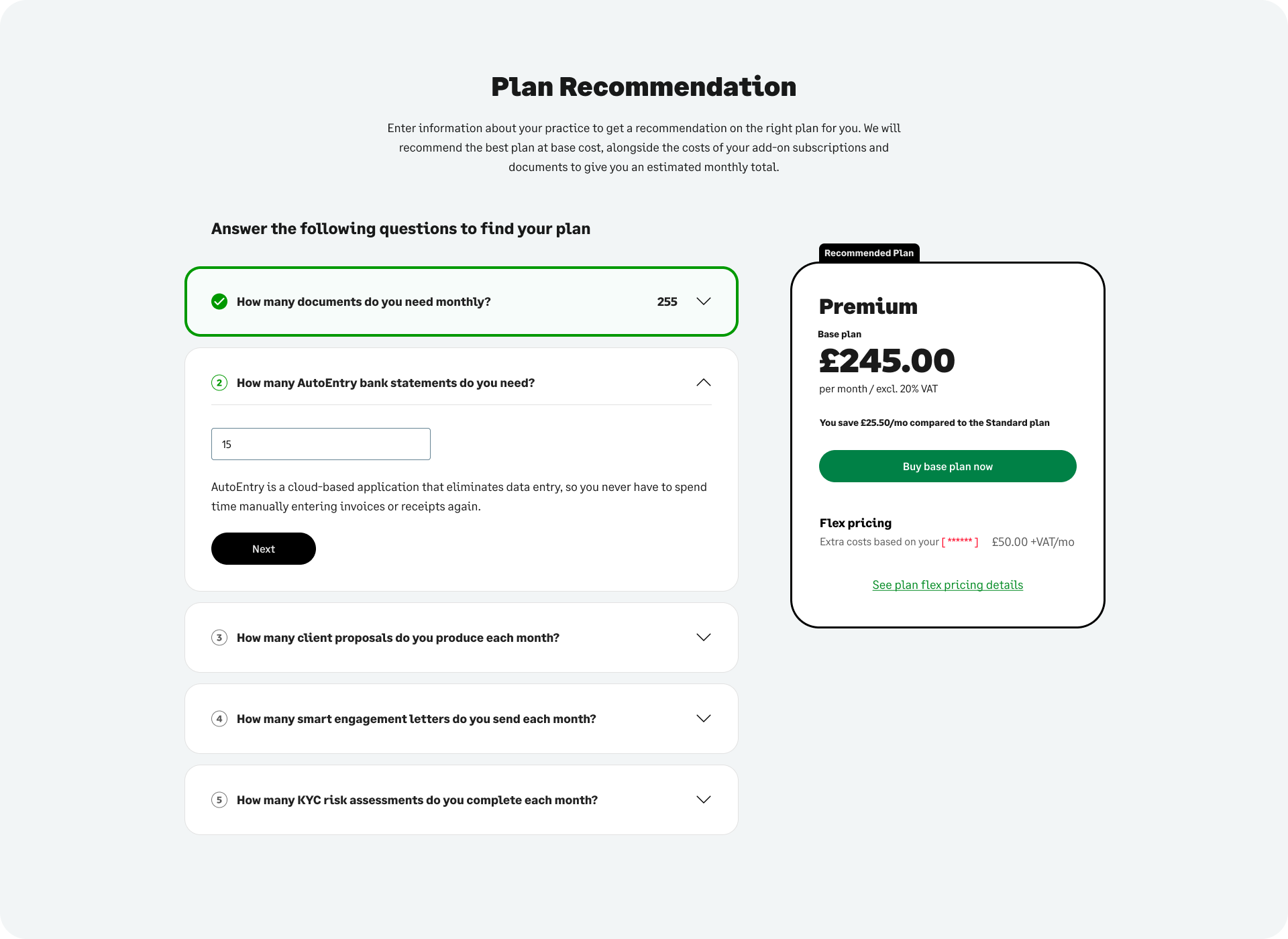
Components:
- Replace tooltips with paragraphs to improve accessibility, though this may make the design busier.
- Replace “X” icons with chevrons for expand/collapse functionality.
- Ensure the tool is embedded or opens in a modal, keeping plan cards visible.
- Make the flow for mobile not just responsive but optimized for smaller screens.
- On the initial screen, show the Essentials plan (free) as the default.
Visual Consistency:
- Avoid stating “Results updated automatically.” Instead, show changes dynamically as users make selections.
- Show the user’s values in the completed state to avoid unnecessary opening.
FUNCTIONALITY FEEDBACK
Interactivity:
- Ensure CTAs (e.g., “Find your perfect plan”) are clearly defined and accessible.
- Provide a secondary CTA closer to the paragraph for easier access.
- Ensure that CTAs link directly to cart or desired actions.
- Users should see updated numbers and prices dynamically as they interact with the tool.
Logic and Calculation:
- Allow plans to dynamically adjust based on imminent price changes.
- Ensure accurate calculation and display of flex pricing costs and allowances.
Implementation Challenges:
- Ensure designs are adaptable to accommodate granular breakdowns if required.
- Explore options for displaying both plan recommendations and overage costs together.
Once the design got signed off, I moved onto the implementation in Dot.vu, ensuring accurate calculations and dynamic updates for pricing changes. I embedded the tool within the SFA pricing page, maintaining alignment with the design system.
Challenges on implementation:
- Respecting parent page margins and paddings across the different breakpoints, and adapting components for mobile and tablet screens.
- Implementing JavaScript logic but within the functionalities of Dot.vu.
- Enhancing visual elements by incorporating custom CSS for different breakpoints to ensure a responsive design, as the built-in styling tools in Dot.vu lack the flexibility and depth required for advanced customization.
- Figuring out with the Dot.vu team how to trigger a modal opening on the parent website, when the user clicks a button inside the embedded experience.
- Implementing Square Space tracking within the experience.
The team spent a week testing the tool extensively for functionality, responsiveness, and accessibility.
I fixed bugs related to:
- IDs in Content Square tracking.
- Implementing JavaScript logic but within the functionalities of Dot.vu.
- Cross-embedded CTAs linking to hidden parent elements.
- Accurate triggering of modals and navigation to checkout.
- Question states not changing after clicking "Save" or "Update", and Plan Recommendation not updating when updating values.