
CASE STUDY
113 Spring started as a 3-day Shopify implementation challenge and grew into a broader rescue project across pages, custom components and email templates.
I helped stabilise and elevate Chanel's luxury ecommerce experience ahead of launch and beyond, working across responsive build quality, custom Shopify components, QA and post-launch support.
THE INITIAL CHALLENGE
Build five Shopify profile pages for the Emergence post-experience journey, each with gated content, embedded media and downloadable social badges.
MY ROLE
Front-end designer and Shopify specialist, working closely with the Head of Creative and Digital Lead to implement pages, rebuild broken components and support launch delivery.
WHAT CHANGED
The scope expanded into a wider site audit and rescue effort when broken agency-delivered components and inconsistent builds started affecting quality across the site.
OUTCOME
VIEW WEBSITE
5
profile pages delivered as part of the original implementation challenge
40+
Shopify HTML email templates supported as the work expanded beyond the initial build
+30%
total sales growth reported at project level during the broader ecommerce transformation
My role was to implement new pages by reusing and adapting existing patterns — font sizes, imagery, and layouts — to ensure consistency. I also worked extensively on fixing inconsistencies across the site, aligning the final build with both the designs and Shopify’s requirements. The process demanded attention to detail, adaptability, and constant iteration.
Responsive implementation of custom components
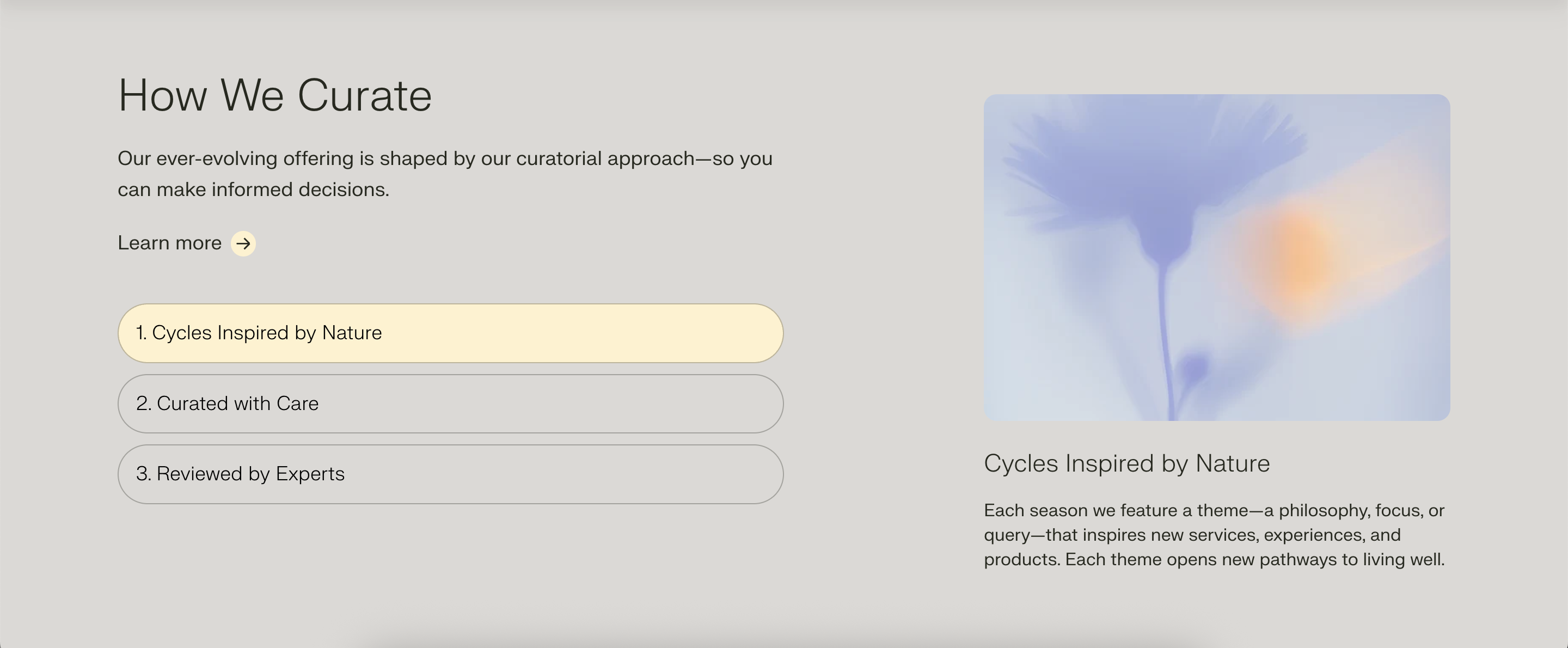
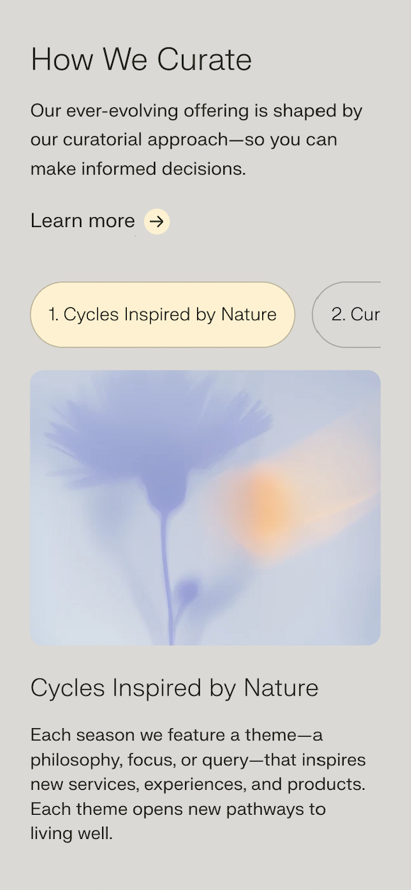
Responsive Tabbed Component
When I joined the team, they had previously partnered with an agency that had delivered a tabbed component on Replo but it was not behaving as it should. The issue was that the logic wasn't inclusive of the behaviour of the tab slider on mobile. So I proposed building it from scratch with Shopify Liquid.
What was previously built in Replo:
The component that I built:
Screenshot of the mobile layout:
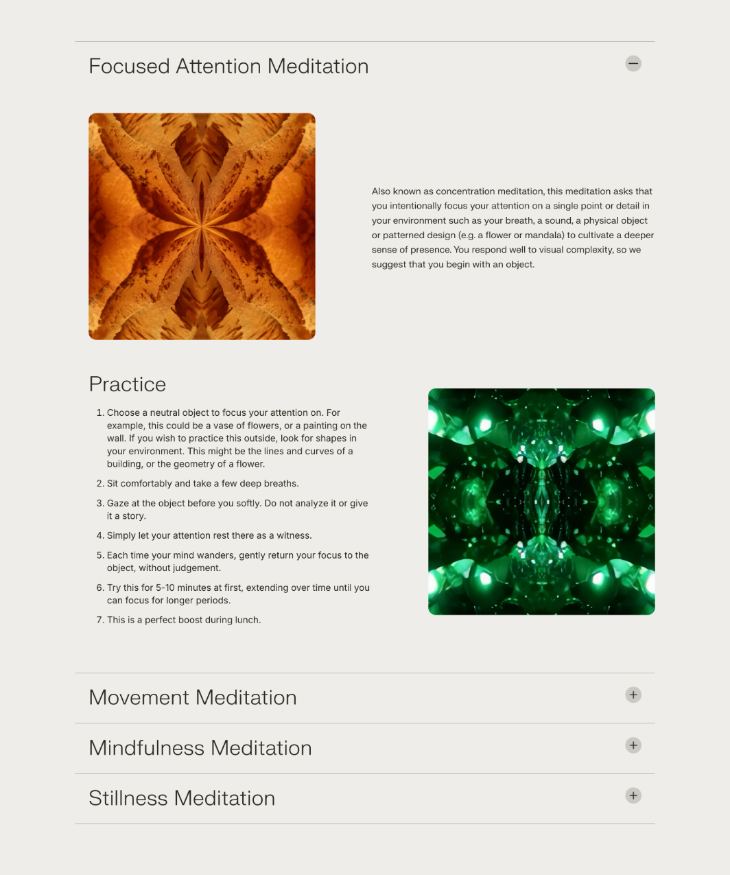
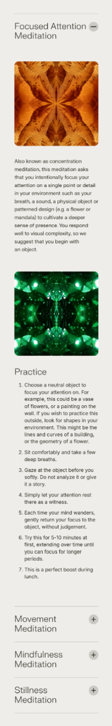
Responsive Accordion
To create a cleaner layout for the four meditation sections, we implemented a responsive accordion. Initially, we explored a tabbed interface, but after evaluating the user experience, the team agreed that the accordion offered the most intuitive and visually organized solution. This approach improved content accessibility and maintained a streamlined design across devices.
The component that I built:
Screenshot of the mobile layout:
The debugging marathon
This might sound like a LinkedIn post, but I honestly loved working on this project. The teenager/young adult in me who studied Fashion Design at university would have never guessed I’d one day collaborate with Chanel — but as a developer!
On day one, my task was clear: build five pages for five different user profiles. Most of the main pages had already been created and were “signed off” from a design standpoint. My role was mostly to replicate patterns that were already there. But what started as a three-day task turned into weeks of work across the entire site.
I often found myself fixing inconsistencies, adjusting layouts, and ensuring the implementation matched both the designs and Shopify’s realities. Without a design system or UI kit, many small fixes multiplied quickly, leading to a lot of reactive patching: font sizes, spacing, and alignment issues that cascaded across pages.
As a designer at heart, my instinct is to anticipate issues, propose scalable solutions, and streamline the workflow from design into development. I suggested a more systematic approach at the start — it would have taken longer upfront, but saved countless hours later. The team preferred to move ahead with quick fixes, which meant I ended up spending a lot of time resolving inconsistencies.
In the end, I delivered a polished result and learned a valuable reminder: every day counts as a freelancer, and companies can save significant time and budget when they invest in an integral, system-based approach from the start.