CASE STUDY
Petworld E-Commerce Refresh supported a WooCommerce-to-Shopify migration and brand refresh for an established Irish pet retailer.
My contribution focused mainly on branding, UI direction and migration-related design work within a broader ecommerce transformation. The goal was to modernise the experience without making the brand feel unfamiliar to loyal customers.
THE OPPORTUNITY
Use the platform migration as a moment to refresh the visual identity, improve browsing clarity and make the store feel warmer, more modern and more usable.
MY ROLE
UI designer focused on brand direction, homepage exploration, visual hierarchy and design decisions that could work within Shopify theme constraints.
THE FOCUS
Create a distinctive but scalable design direction through colour, category cards, iconography and a clearer content structure, without depending on heavy custom development.
OUTCOME
VIEW LIVE SITE500%
revenue growth within 2 years at project level after the wider transformation
x2
conversion rate improvement reported post migration
0
SEO loss during migration, while repeat customer growth rose from 30% to 50%+
Our biggest challenge as a team was ensuring all stakeholders were aligned on objectives and timelines, and making realistic compromises knowing this would be our first approach to this tool and there would be future iterations.
CHALLENGE
CONTEXT
Petworld aimed to transition from its old website to a Shopify platform, leveraging this opportunity to refresh its design while maintaining brand recognition for existing customers. The openness of the client allowed creative freedom but also demanded strategic alignment to avoid alienating loyal customers.
PROBLEM
The old design was visually unappealing and lacked functionality, while the new site needed to balance brand evolution with consistency. A heavy logo, outdated colors, and stark visuals were key challenges.
GOAL
- Modernize Petworld’s digital identity.
- Ensure a playful, pet-centric design that aligns with their brand.
- Retain existing customers through strategic continuity.
SOLUTION
A phased design evolution prioritizing:
- A vibrant, balanced color palette.
- Playful and dynamic visuals (category icons, banners, and product cards).
- Simplified navigation and a mobile-first approach.
We clarified the platform’s core purpose, target audience, and key goals to ensure a user-centered design strategy.
BRIEFING HIGHLIGHTS
- Prioritize continuity with subtle evolutionary changes.
- Use the Shopify platform and minimize custom code for scalability.
- Develop a quick brand guide, including colors, typography, and visual elements.
- Propose a design prototype focusing on banners, category icons, and homepage elements.
KEY CHALLENGES
- Modernizing without alienating existing customers.
- Achieving brand distinction in a competitive market.
- Working within Shopify theme limitations while delivering a unique look.
During this process we analyzed competitors, focusing on their strengths and weaknesses, and concluded on a design direction focusing on vibrant banners with line drawings and animal-focused imagery, and a balanced mix of bold and pastel colors to maintain a friendly aesthetic.
SIMILAR PLATFORMS
Zooplus
A leading European pet supply retailer offering food, accessories, and care products for a variety of pets.
Key Features:
- Comprehensive navigation with a "Shop by Pet" structure (e.g., Dogs, Cats, Small Pets).
- Subscription services for recurring orders like food and essentials.
- Regular discounts and loyalty programs for customer retention.
Visuals & UX:
- Utilizes a clean, professional interface with limited use of vibrant colors, focusing on functionality over flair.
- Category pages are text-heavy, which may limit visual engagement.
Petstop
An Irish pet retailer known for its physical stores and online presence, catering primarily to local markets.
Key Features:
- Product bundles and offers specific to local pet care trends.
- In-store services like grooming advertised prominently online.
Visuals & UX:
- Vibrant and approachable design with bright colors to attract attention.
- UX is focused on local convenience rather than extensive eCommerce features.
Chewy
A US-based platform specializing in pet products with a strong focus on customer service.
Key Features:
- Subscription services and auto-ship options for essential items.
- Personalized customer service, including handwritten notes and direct support.
- Extensive customer reviews and recommendations on product pages.
Visuals & UX:
- Simple and user-friendly, with a focus on bright, pet-friendly colors like blue and yellow.
- Homepages showcase a mix of seasonal promotions, new products, and trending items.
Pets at Home
UK-based retailer with both online and in-store shopping options, offering a mix of products and services like grooming and veterinary care.
Key Features:
- Online booking for grooming and veterinary appointments.
- Loyalty rewards through the VIP Club program.
Visuals & UX:
- Heavy use of green tones for a natural, pet-friendly aesthetic.
- Visual hierarchy emphasizes services and memberships over product browsing.
We created high-fidelity prototypes in Figma for the Homepage, and went through 6 rounds of revisions with the agency and Petworld stakeholders. We focused on:
- Header & Navigation: Clean white header with dropdowns for simplicity.
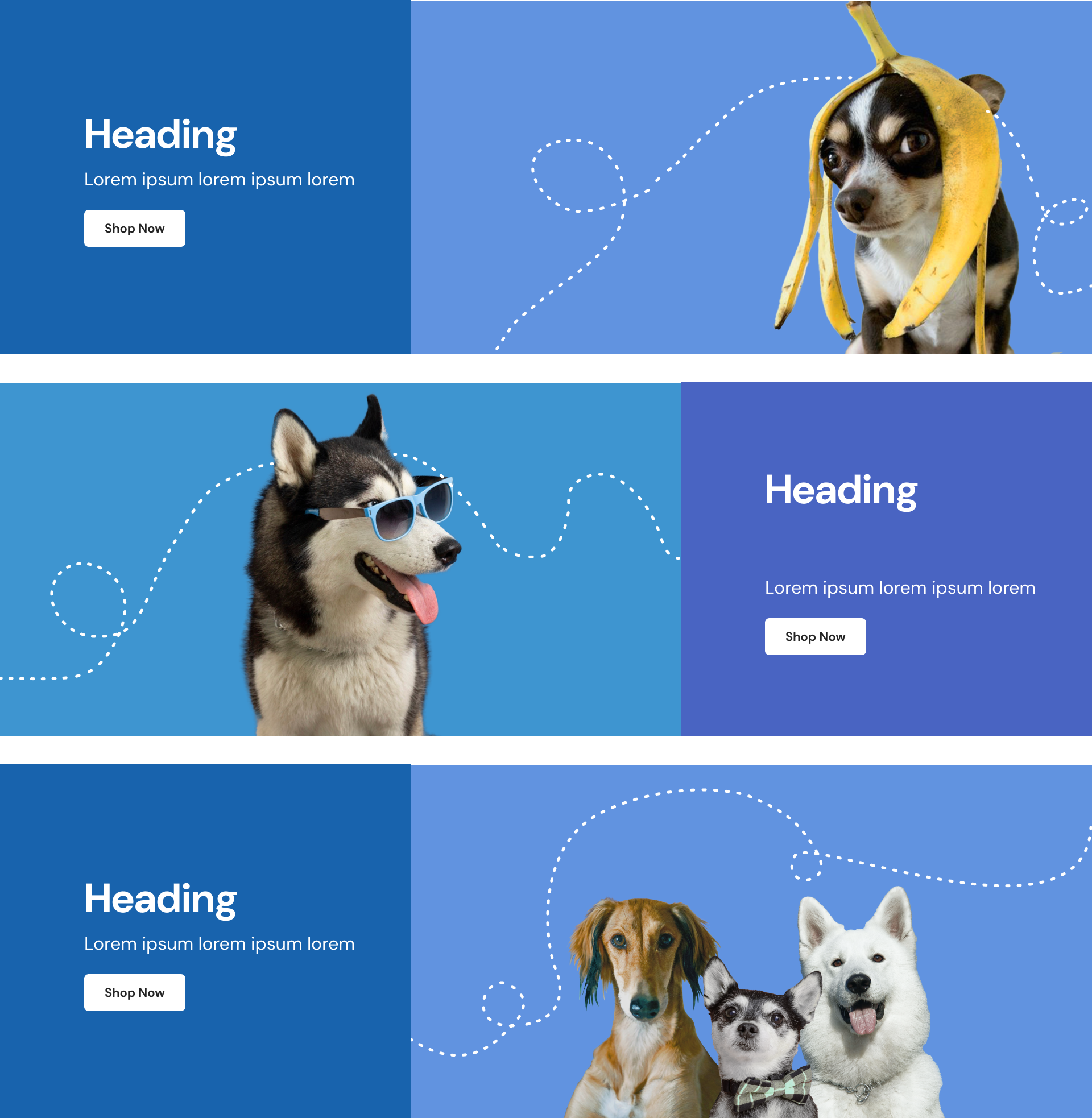
- Hero Banner: Vibrant visuals combining blue, orange, and purple accents with pet imagery.
- Category Icons: Circular icons with colorful backdrops and animal illustrations.
- Product Cards: Hover effects to display product details and color options.
WIREFRAMES
VERSION 1
We designed an initial concept meant to be as bold as it could, with vibrant colours and a palette that would possibly reduced and polished, and plenty of variations for illustrations.
VERSIONS 2 TO 6
FEEDBACK
- Experimented with a green color theme for the banner sourced from PetCity, ensuring it aligned with the overall brand style. Simplified the top banner by removing unnecessary visual noise, such as paw prints and other icons, and reduced its height for a cleaner, more focused visual hierarchy. Propose a new background color for the category circles that complemented the overall design theme.
- Transitioned to a black color for the main heading (H1) to create a stronger visual impact. Used a black version of the logo across the site to maintain consistency and enhance readability, and xplored a version without dog elements to make it more versatile for broader audiences. Simplified the color palette by focusing primarily on the existing shades of blue and green.
- Aligned the bold colors of the hero banner with the softer, pastel tones used throughout the rest of the design for a more cohesive look. Incorporated shades of grey for the category cards. Illustrated additional animals to represent the various categories, ensuring they aligned with the existing style.
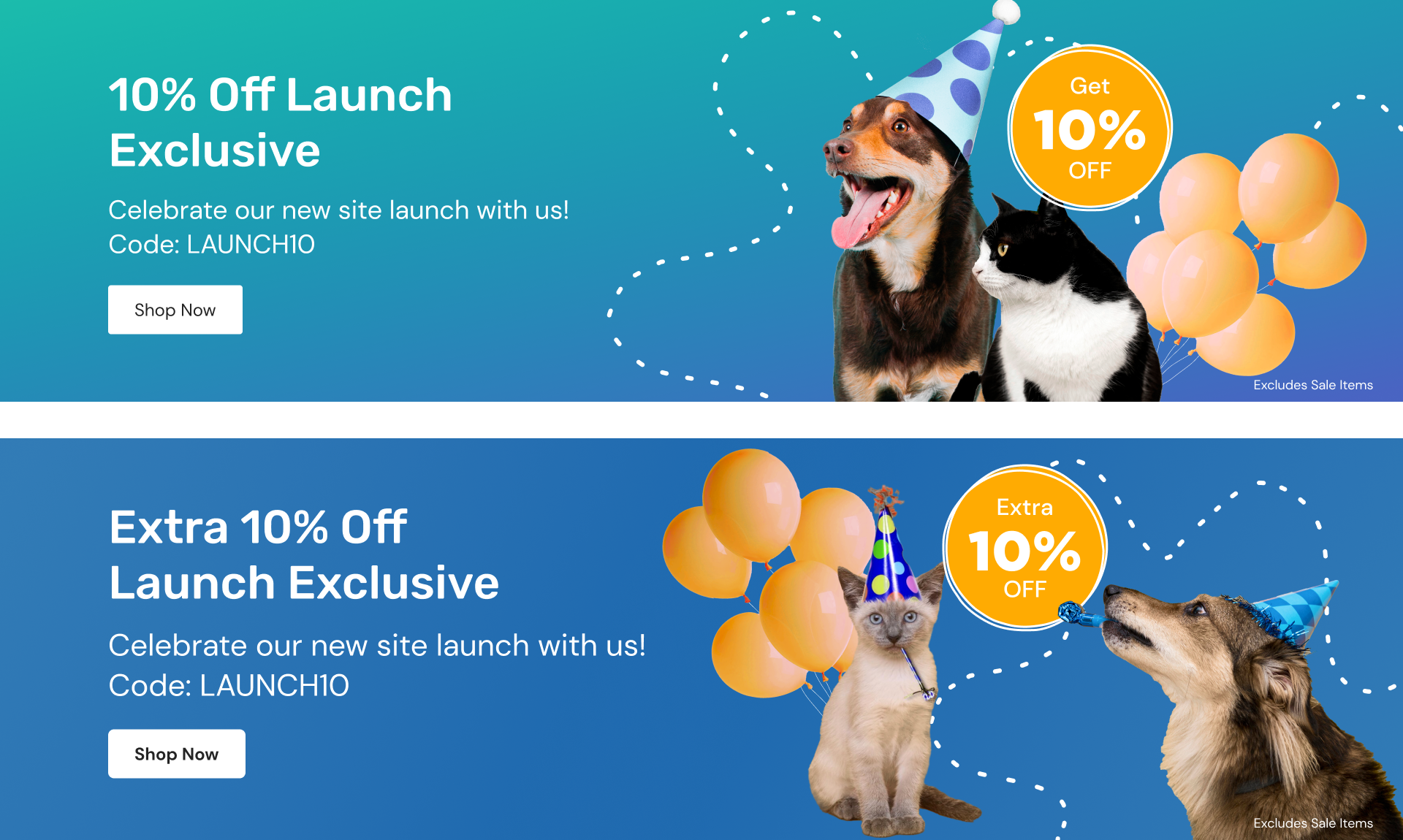
- Featured a hero banner that prominently showcased a curated collection of items currently on sale, ensuring an engaging first impression for users. Ensured all text displayed over dark background colors were styled in white to maintain excellent readability and visual contrast.
- Removed heart icons from the interface to create a cleaner and more streamlined design.
- Incorporated bones, paws, and other thematic elements into illustrations for consistency and charm. Explored a version of category cards using the provided icons. Restored the logo colors to match the original design, ensuring brand consistency.
FINAL VERSION
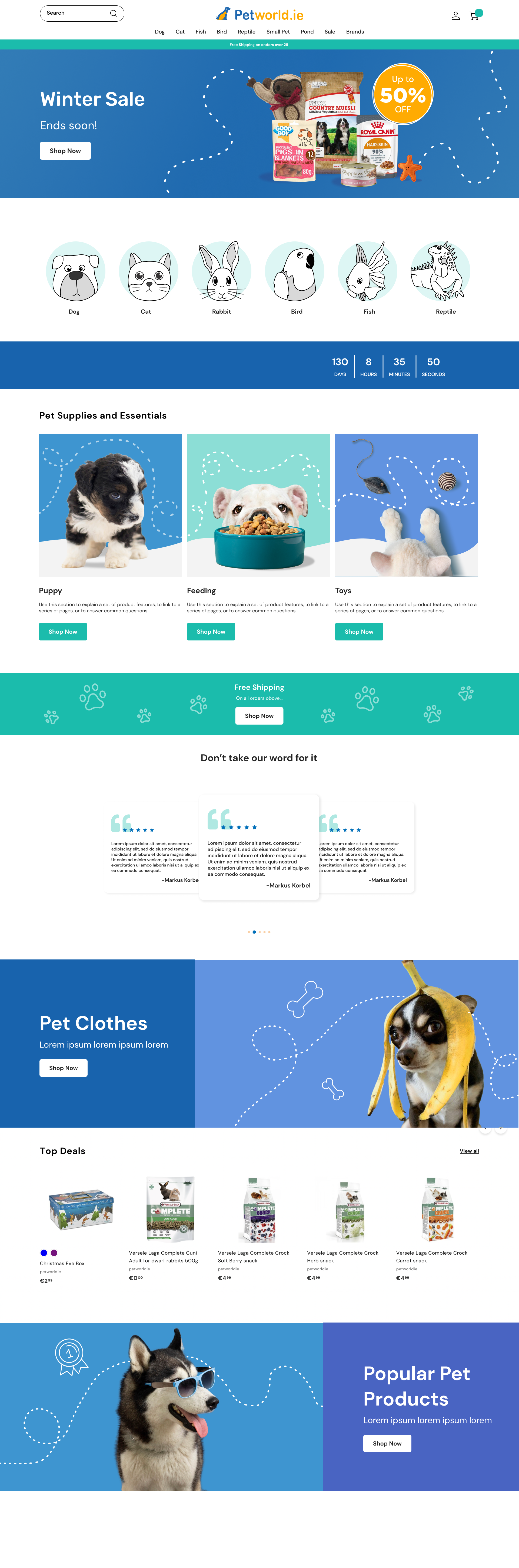
FEEDBACK
- We changed the icons back to illustrations to create a more visually engaging and cohesive design.
- Increased the size of category titles to improve readability and emphasize the hierarchy of information.
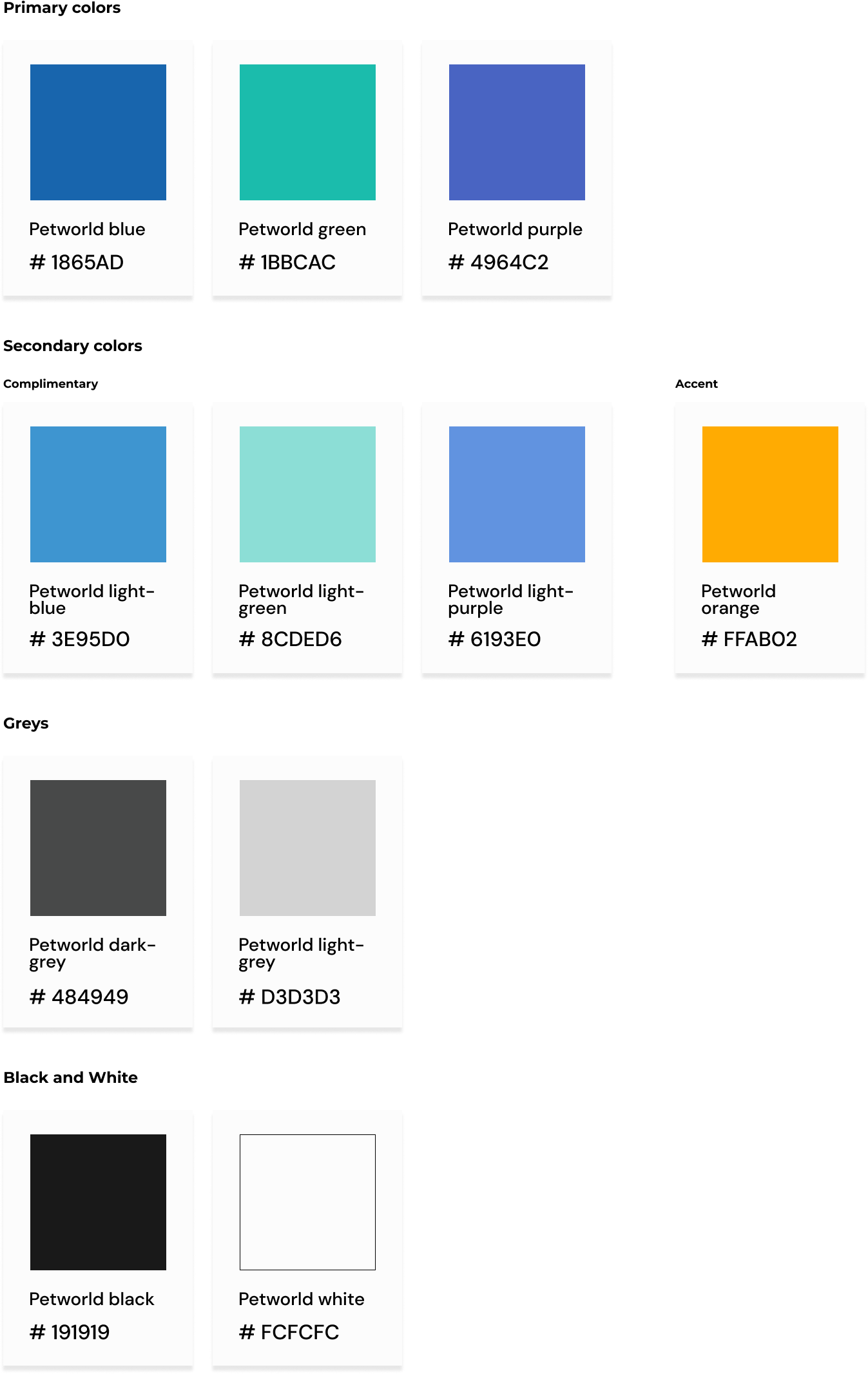
COLOR PALETTE
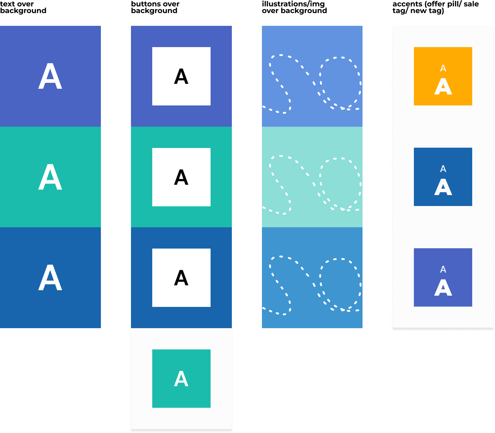
USE OF COLOR
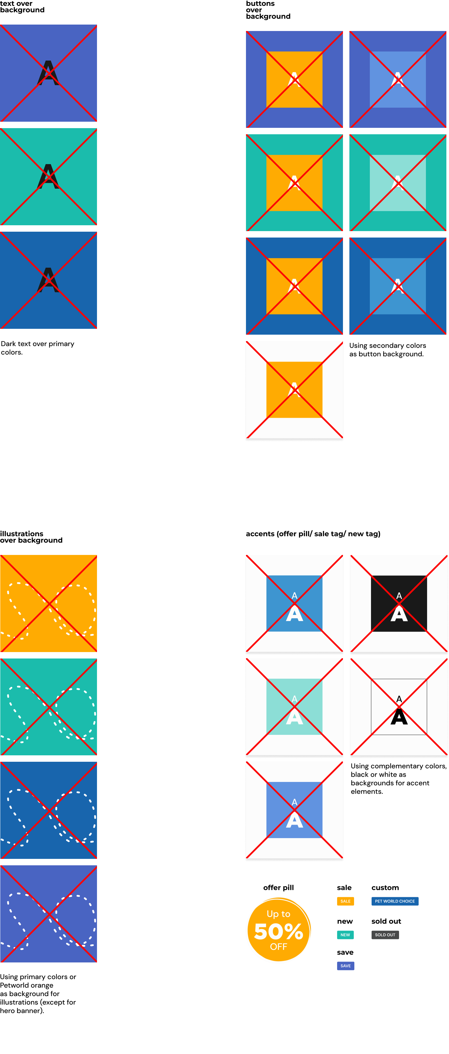
DO´S & DON´TS
TYPOGRAPHY
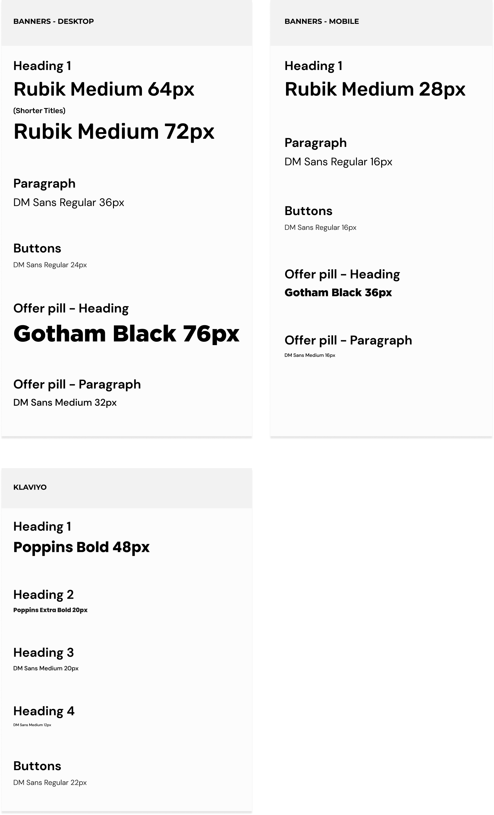
ISOLOGO

BUTTONS

CATEGORY TILES
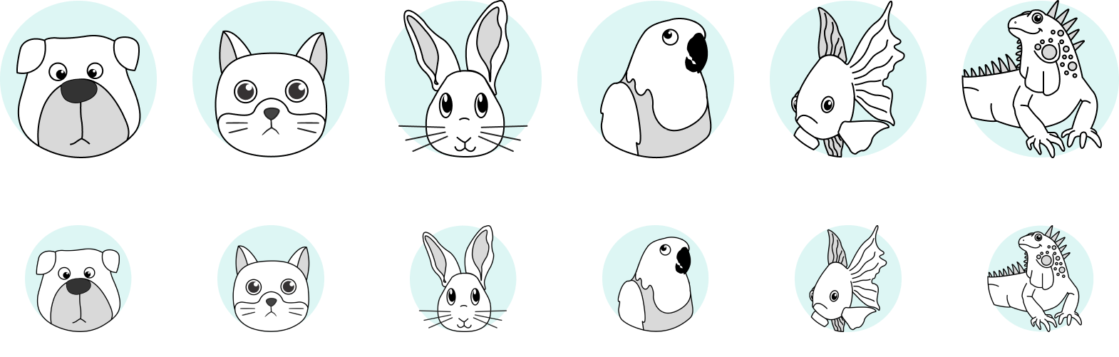
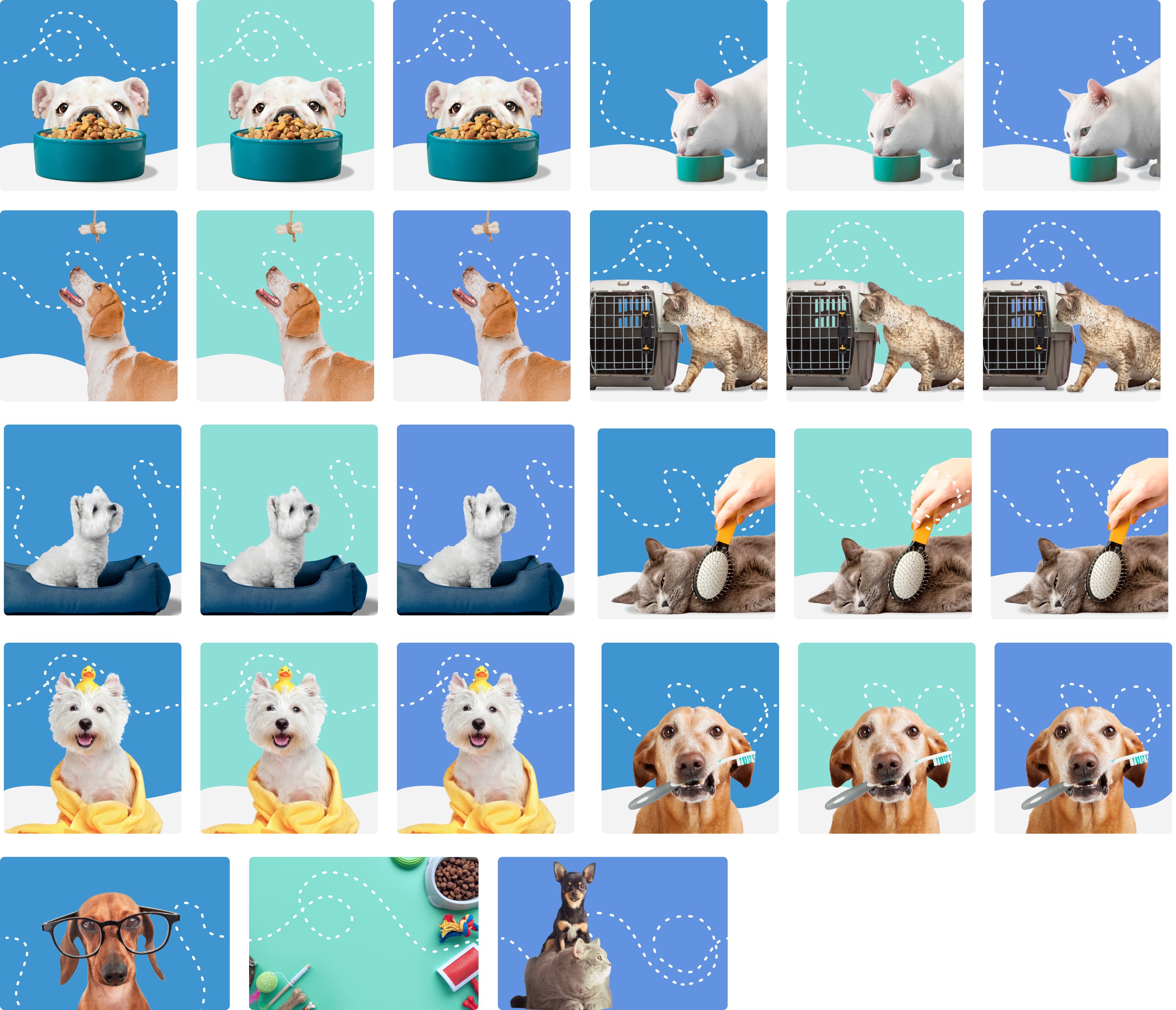
ILLUSTRATIONS

BANNER SLIDERS
HERO PROMO BANNER
OTHER PAGES BANNERS
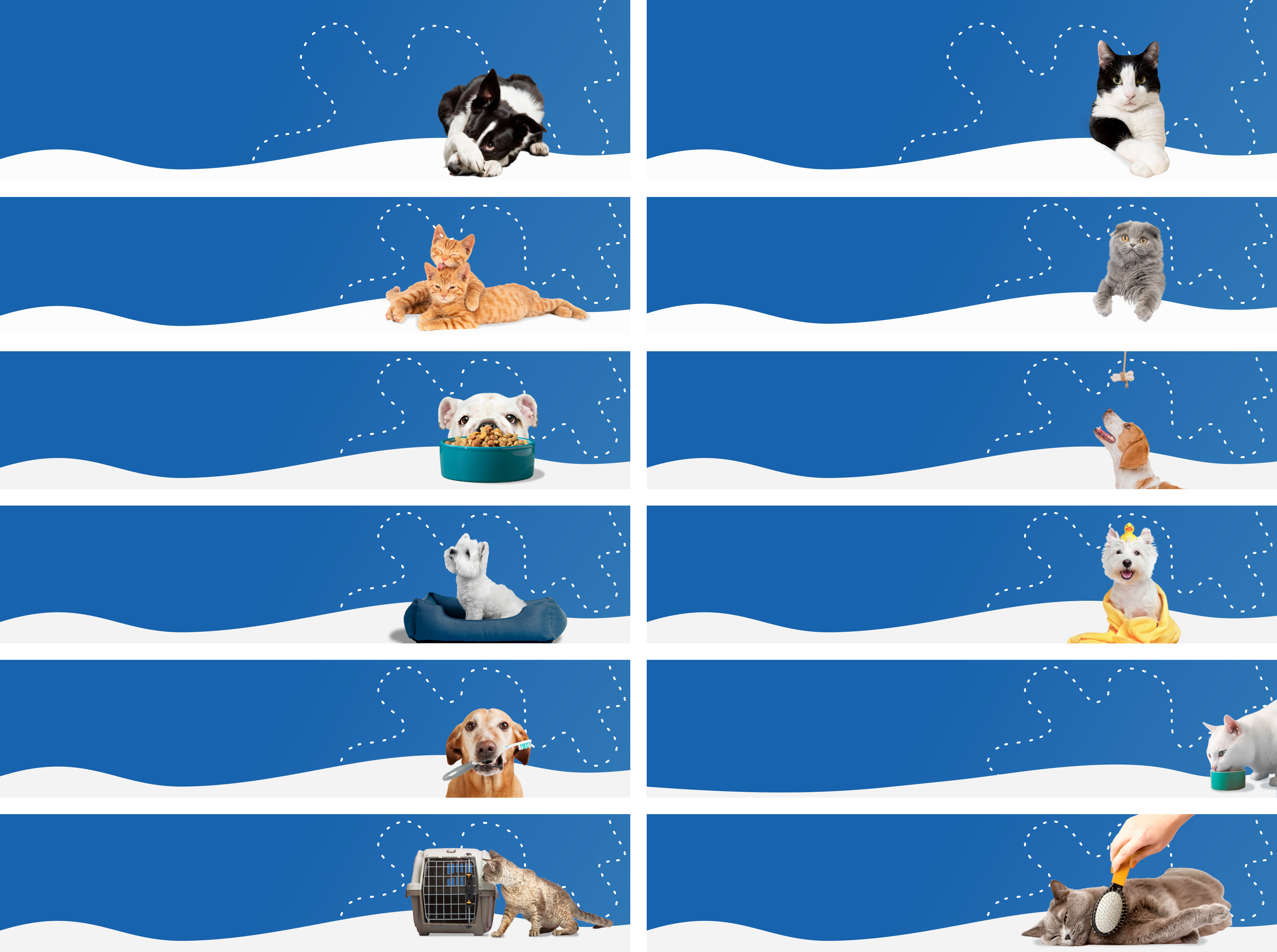
SMALL PROMO BANNERS
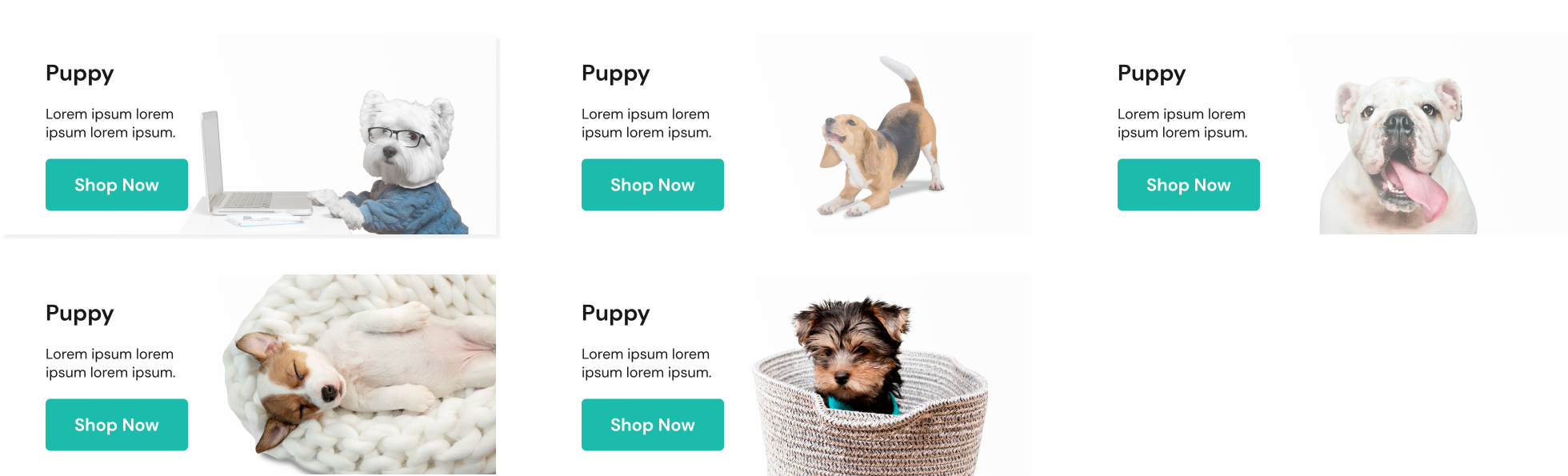
CATEGORY CARD BANNERS
OLD WEBSITE

NEW WEBSITE